Day in the Life
A Day in the Life of Presh Copywriter, Mallory McGourley
Hear it from the source: learn what life is like for a copywriter at Presh Marketing Solutions.
The world of design is ever changing. Learn what's in and what's out in the new year.
As a web designer, it’s my job to educate my clients on the latest trends. Whenever I browse the internet, I’m always taking in design choices in the back of my mind. In this blog, I’ll lay out my predictions for how web design will change in 2022. We’ll discuss what I believe will become a trend and what will be written off as tacky.
Scrollytelling: fuses scrolling and storytelling by changing backgrounds, moving text, and triggering interactive animations as a users scrolls through a website.
Scrollytelling is an increasingly popular way to convey an intricate story using visual scroll effects to captivate audiences. The elements are sequenced together in chronological order to convey a specific message to the visitors.

Infrared Mind Body, uses large images and text that appear using animations. Large close-ups, dim-lit images, large-scale typography, and smooth transitions bring a level of sophistication to their brand.
Why I think this is trendy:
Keeping people on your page is essential. Humans can’t resist a story. If all they have to do is scroll down the page to see what happens next, they will.
As the title suggests, micro animations are small, subtle animations that are used to guide users through interactions on your website. They add an element of liveliness to your website, like Smashmallow’s hero image.

Micro animations have been popular for a few years, but in 2022, it’ll be about using them organically. Designers should be thinking about how things move, if they’re on a curve or wheel instead of on a flat plane.
Why I think this is trendy:
Most people leave a website after scrolling halfway down the page. Micro animations can encourage users to scroll down just a bit more, decreasing bounce rate and keeping them on your site.
We can expect bold color pallets to dominate the websites of the future. The use of bright contrasting colors to attract users' attention and create a feeling of playfulness helps brands connect with their audiences through design.
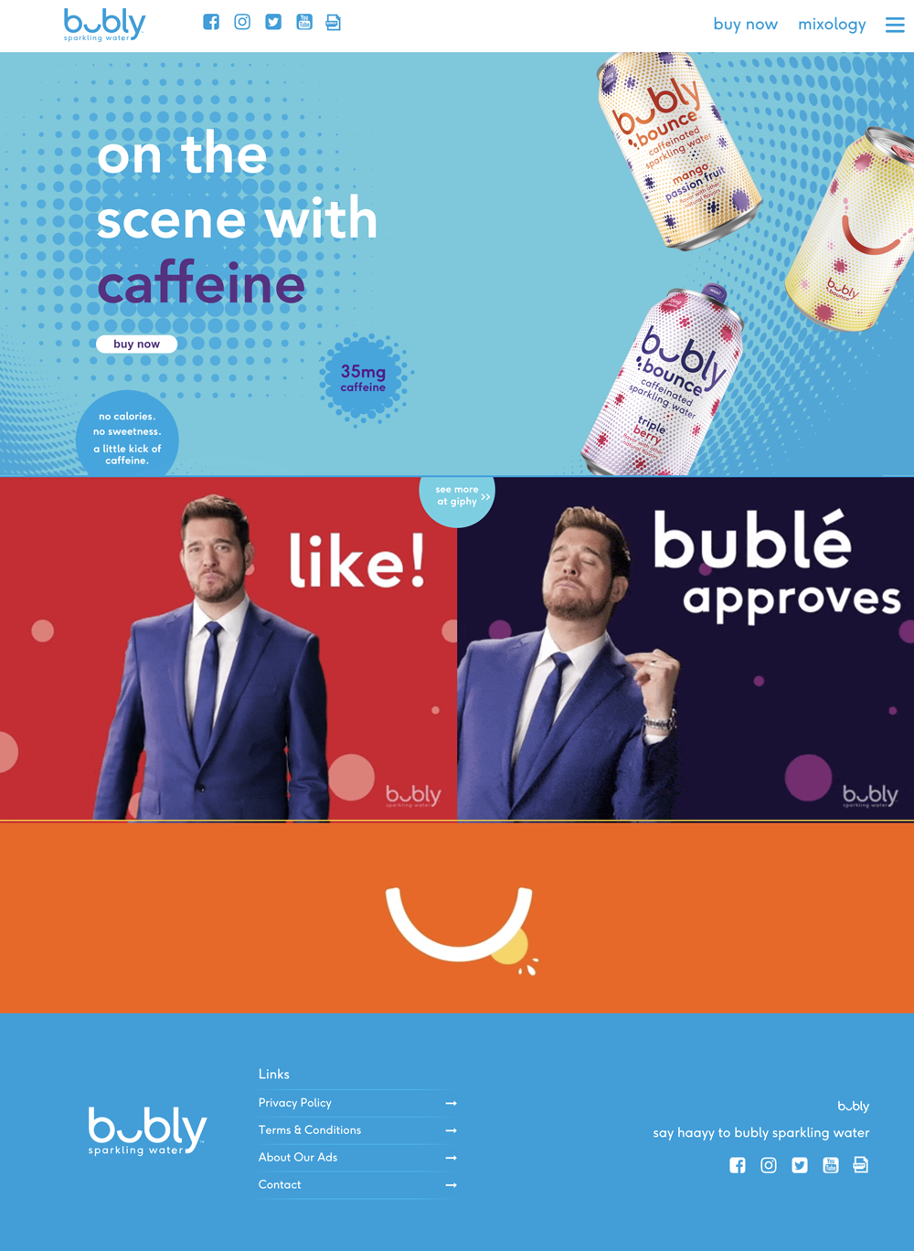
These bold colors will build excitement and create a more entertaining experience for users which will be helpful in conversion rates. Bubly sparkling water’s website does an amazing job at taking bold colors into consideration when designing their site.
Why I think this is trendy:
There is a reason most CTAs are bright colors. Bright colors grab your attention and set that content apart from the rest of the design. Colorful websites do the same—they demand more attention.
As we just talked about this year is all about bold colors, engaging content, and a playful air to design. Minimalism, sometimes called “flat design” is all about clean, sometime monochromatic or limited color design. It has typically been associated with a lot of white space (think Apple). In 2022, the traditional idea of minimalism will be out. A blended minimalist design using more color will likely still be around.
Why I think this is tacky:
The pandemic has hit us hard emotionally. During the pandemic, 4 in 10 adults in the U.S. reported symptoms of anxiety or depressive disorder. (Compared to only 1 in 10 before.) Bright colors affect our psychology—they make us happy. I believe brighter websites are what people want and need to see.
When you’re using a mobile device, you’ll know the hamburger menu: The three horizontal lines in the upper corner of the display. These lines will show you the navigation area when tapped. This is part of the User Interface (UI).
User Interface (UI) : The places on your website where users interact with digital elements or communicate.
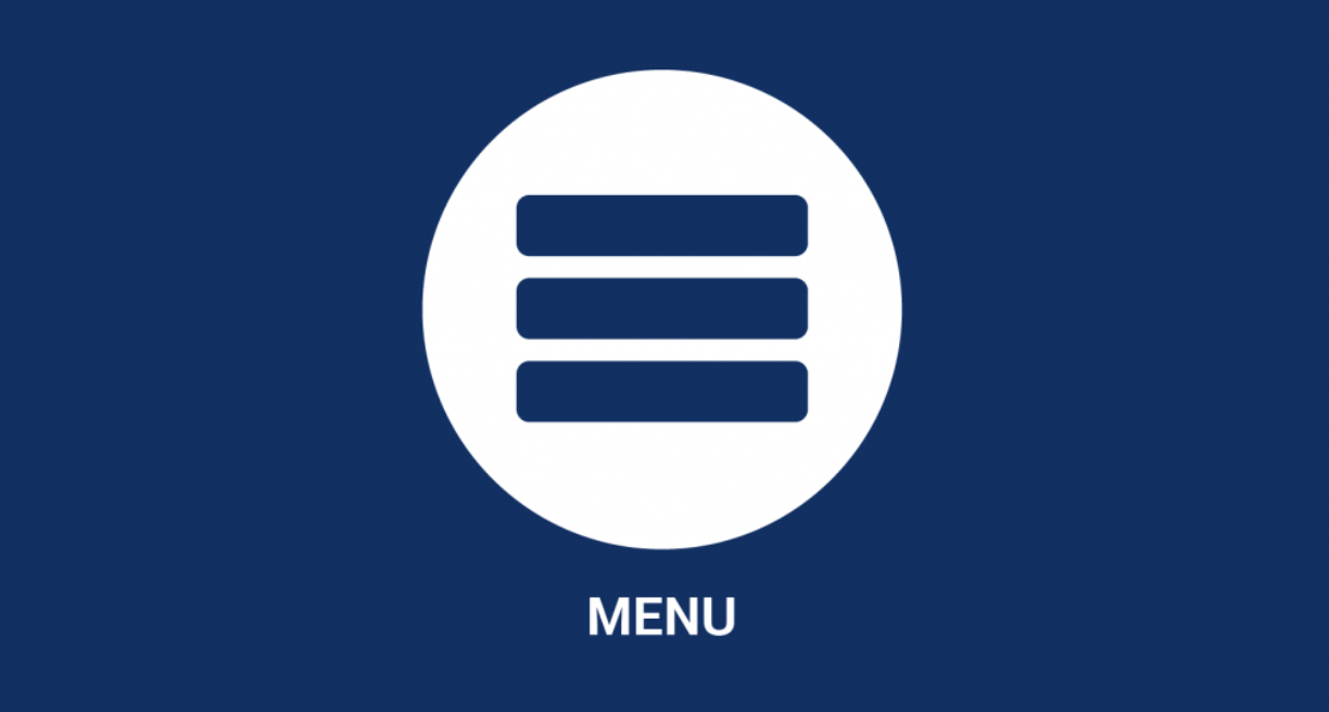
Nowadays, regular desktop websites sometimes receive the hamburger menu treatment, which confuses visitors and causes a bad User Experience (UX).
User Experience (UX) : how a user interacts with and experiences a website or design.
Why I think this is tacky:
Hamburger menus “gate” information. They keep it out of plain sight, forcing web visitors to put in just a bit of extra effort to find what they are looking for. Other sites will offer easier experiences. Users will be quick to abandon their search and take an easier path on someone else’s site if the option is available.
Hero Banner : Usually located on the homepage of a website, this is a “carousel” of rotating images and text, similar to digital billboards that switch the displayed advertisement every few seconds.
How many times do you actually click on one of the images (or multiple images) in a hero image slider? Most users ignore these sliders and often a slider makes it more difficult to find important information. With auto-play sliders, you don’t know when a user will land on the content. As soon as they see something that might be of interest, it moves away to the next thing.
Why I think this is tacky:
If a user is interested in something on the hero banner, but the content changes before they can react, it is often too much work for a user to wait for it to come around again. You've just lost a possible conversion. It’s better to yell one message than to whisper millions.
Presh Marketing Solutions has helped dozens of organizations completely renovate their online presence. We work with clients to create modern, effective, lead-generating designs. Check out our portfolio to see some of the work we’ve done.

Hear it from the source: learn what life is like for a copywriter at Presh Marketing Solutions.
Learn what a typical day is like for Sydney, Presh’s account manager.
Learn what a day in the like is like for Presh’s Creative Director